 The Tangison Studio



















The system
A locked design system, not a mood board.
Every page this studio ships, for itself or for a client, reads the same rules first. The genre is editorial studio work, held to the craft level of a named reference rather than the look of one. What follows is the system as it is enforced today.
The palette
Bone
Paper. The light surface every page prints on.
#F6F4EF
Warm raise
Raised cards and table surfaces, one step above bone.
#FEFDFB
Atlantic black
Ink. Text, headings, and the dark theme's foreground.
#111315
Ink paper
The dark theme's surface, with raise at #14181D.
#0C1014
Signal Teal
The only accent. Capped at five percent of any viewport.
#2CB5B4
The type stack
Poppins, 600 and 700
Display and headings. Two weights only; hierarchy comes from size and spacing, not from collecting weights.
Satoshi, 400, 500, and 700
Body text and interface copy, served locally as woff2 subsets so the reading experience does not wait on a font network.
JetBrains Mono, 400 and 500
Functional metadata only: labels, coordinates, timestamps. Mono never carries sentences worth reading slowly.
The rules every page obeys
One accent, capped
Signal Teal is the only chromatic color in the system. It never exceeds five percent of a viewport, never tints a large surface, and never appears as a gradient. Restraint is the mechanism: one color earns attention precisely because nothing else competes with it.
No pure black or white
Text is Atlantic black on bone, never #000000 on #FFFFFF. The pair softens glare on mobile screens and keeps printed matter from looking harsh. The dark theme inverts the same pair: bone text on ink paper.
Hairlines carry structure
Layout is drawn with 1px rules at ink opacity rather than boxes and shadows. Cards exist, but they are quiet: a warm raise surface, a hairline edge, no glass, no glow, no drop shadow that pretends to be depth.
Type does the talking
Poppins carries display sizes in two weights, Satoshi carries reading text, and JetBrains Mono is reserved for functional metadata: labels, coordinates, timestamps. Two sizes of the same voice beat five sizes of noise.
Art, not stock
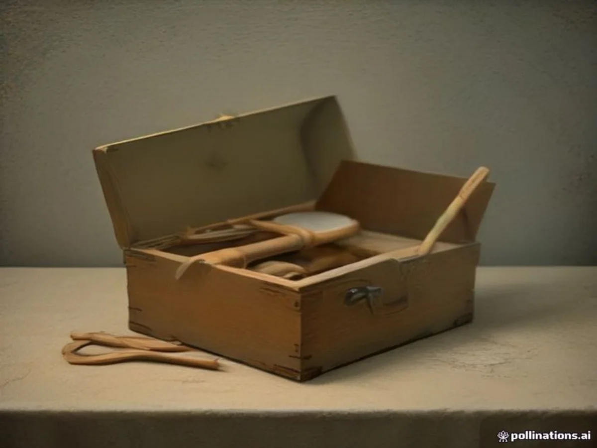
Photography is art-directed for the studio: paintings of rooms, coastlines, and still lifes, used with purpose and never as filler. Scrim gradients over photography are the only gradients the system allows.
Claims are dated and named
The voice states what can be checked: a track record lists clients, locations, and dates; a case study names the decisions. No invented metrics, no undated superlatives, no filler adjectives.